Service · Plant Health

See which vines are thriving — and which are falling behind.

Satellite images reveal how vigorously your vines are growing, plot by plot, patch by patch — often weeks before a stressed area would be visible walking the rows.

Get in touch →
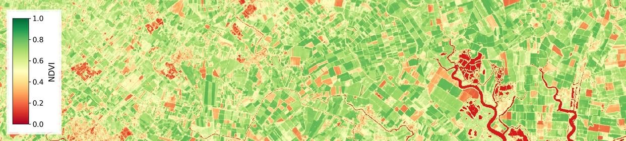
Satellite-derived vigor map showing healthy (green), moderate (yellow), and bare or stressed (orange/red) vegetation across a landscape

Dark green marks dense, healthy growth; yellow and orange mark thinner cover or early stress — visible from space, field by field.

A vigor map you can act on

Not every part of a vineyard grows the same way. Some patches push out dense, healthy canopy; others lag — thinner leaves, slower growth, early signs of stress. On foot, those differences can take weeks to become obvious. From satellite, they show up as a simple colour map: dark green where vines are thriving, yellow and orange where they're falling behind.

That map updates regularly through the season, so you're not just seeing a single snapshot — you're watching how each part of the vineyard is trending, block by block.

A number that tracks the harvest: in our longest-running vineyard partnership — three years and counting with the Adega Cooperativa de Pinhel — the average vigor reading from April to September has tracked closely with how much fruit came in at harvest. When the vines look strong from space, the crop tends to follow.

What this replaces

Instead of relying on spot checks as you walk a handful of rows, or only noticing a struggling patch once it's visibly behind, you get full-vineyard coverage every few days — so a problem in a corner you rarely visit shows up just as clearly as one by the gate.
Checked against real drone flights and real harvests

Two ways we've tested whether this number actually means something.

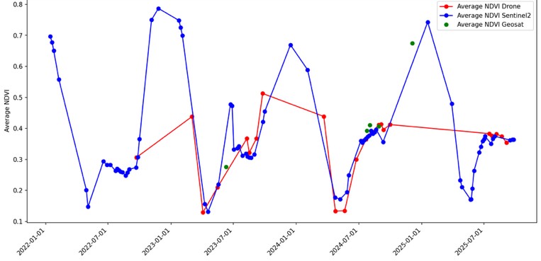
Chart comparing average vigor readings from drone surveys and satellite estimates from 2022 to 2025, tracking closely together over time

Satellite estimates track independent drone measurements

Every few months we fly a drone over the same plots and compare its reading against the satellite-based estimate. Across four growing seasons, the two have consistently moved together — confidence that the number you get between drone flights is a reliable one.

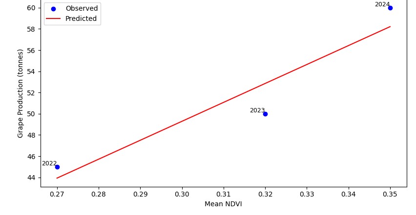
Chart showing a clear upward relationship between average vigor from April to September and grapes harvested in tonnes, for 2022 to 2024

Higher season-average vigor, more grapes at harvest

In our longest-running partnership — with the Adega Cooperativa de Pinhel — the average vigor reading from April to September has risen and fallen in step with the tonnes of grapes actually harvested each year.

A number about your vines, not your inter-row

What grows between the rows can throw off a vigor reading if it's not told apart from the vines themselves — and it varies a lot from one region to another.

Bare soil — Pinhel

In dry-farmed vineyards around Pinhel, the ground between rows is often bare earth. That reads very differently from a leafy vine canopy, so it's easy to separate the two.

Grass cover — Bairrada

Around Bairrada, cover crops or grass often grow between the rows. Left unseparated, that green cover can make a struggling block of vines look healthier than it is.

Our process draws a boundary around each row of vines and reads the canopy on its own — so the vigor number you get reflects what the vines are doing, not what's growing (or not growing) in the gaps between them.

Standard-resolution satellite vigor map over a vineyard plot, showing blocky, blurred pixels that don't distinguish individual vine rows
Standard satellite pixel: rows and inter-row blur together.
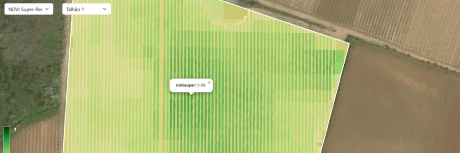
Enhanced-resolution vigor map over the same vineyard plot, showing individual vine rows clearly separated from the ground between them
Our processing: individual rows are clearly visible.

Same plot, same date. Left: a standard satellite reading, where each pixel covers about 100 square metres and blends vine and inter-row together. Right: our processing resolves the individual rows, which is what makes clean canopy/ground separation possible in the first place.

Built to catch what's easy to miss on foot

👁️

Spot trouble before you can see it

Vigor differences often show up in the imagery weeks before they're visible walking the rows.

🍇

See the real vine, not the row cover

Row-by-row separation means the reading reflects your vines, whatever's growing — or not — between them.

📈

A number that tracks the harvest

Season-average vigor has closely tracked actual harvest volumes in our longest-running vineyard partnership.

From a satellite pass to a vigor map

No sensors to install, no site visit required.

1

Satellite images arrive every few days

Regularly refreshed imagery covers your vineyard automatically, all season long.

2

We isolate the vine canopy

Rows are separated from the ground between them, so the reading is about the vines specifically.

3

You get a plot-by-plot vigor map

A clear, colour-coded picture of where vines are thriving and where they need attention.

Curious what your vineyard's vigor map looks like?

We're expanding this service alongside our existing partnerships.

Get in touch →